Paint Colour Palettes Inspired By The Seasons
When it comes to colours, what’s your favourite season? Do you like the bright, warm colours of fall, the sweet and floral spring colours?
Every season has its own aesthetic, different from the “seasonal colours” of fashion trends. No matter what style your home is, there’s room for a seasonally inspired colour palette like the ones we’ve got for you today.
What’s great about these seasonal colour palettes is that they’ll look good any time of the year. So, without further ado, let’s get into these pro-curated paint colour palettes inspired by the seasons.
Spring
This palette brings together the best of what we love spring for: those first bright pops of colour after a long, dull winter landscape. But this Benjamin Moore seasonal paint colour palette is also a tad toned down to make it home-worthy.
As a base and primary colour, choose a white or taupe, like Cappuccino. Then, add some pastels. Start with a wispy pastel pink like Cotton Candy, an airy blue like Windmill Wings, and a light green like Fernwood Green. You can also go with a mid-tone green, like Stokes Forest Green, for something darker.
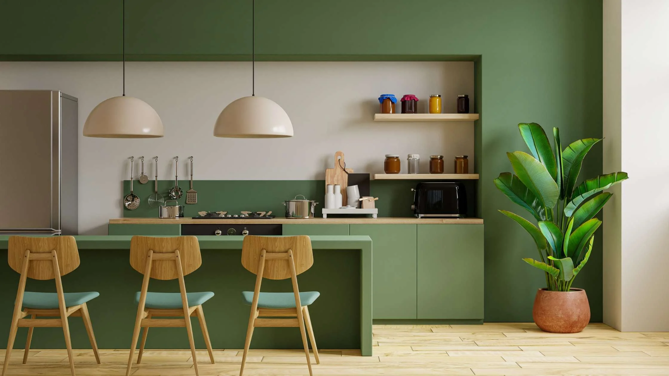
Summer
Summer colour palettes are usually beach-themed, but there’s so much more to summer than going to the beach. This Sherwin-Williams paint colour palette features greens and blues reminiscent of the season’s vibrant foliage, the bright blue sky, and the summer sun.
Sticking to the sandy neutral trend, your primary colour should be a warm beige, like Napery. Then, choose a darker grass green, like Greens, and a lighter blue like Bluebell. Or, you can switch that around with a darker blue, like Hyper Blue, and layer a muted green, like Reclining Green.
Autumn
Falling leaves, cool breezes, and bright, fiery colours everywhere you look. This Benjamin Moore paint colour palette brings a warm and toasty vibe that fall colours are known for while also bringing some earthy or rustic vibes to the table.
Start with a warm peachy tone, like Delicate Peach as your primary paint colour. Add a warm chocolate brown, like Chocolate Truffle and a dark red, like Caliente. Then, go in with bright leaf-inspired tones like Orange Parrot and Golden Retriever.
Winter
Winter is typically seen as cold, bland, and boring. But If you like the relaxing atmosphere that layering blue tones can provide your home, then this winter colour palette by Sherwin-Williams.
Start with a cool white, like Pure White, as your primary colour. Then, layer a grey-blue, like Favorite Jeans and a navy blue like Salty Dog. Finally, balance all those cool tones with a warm beige, like Lamb’s Wool.

Time To Paint? Tru Rollers Has You Covered!
Call Tru Rollers to find your favourite seasonal colour palette, or create one that’s totally personalized to you! Our colour experts are ready to help you shine a light on your favourite season! Contact us to get started.